珊珊同学最近总收到小个子姐妹的私信:“为什么我照着博主学穿搭,效果却总差一点?”其实很多时候,不是技巧不对,而是没选对“核心装备”。今天我就分享几个亲测有效的显高公式,并揭秘那双让我轻松“长高”却不累脚的宝藏鞋子。
一、小个子常踩的3个显高误区
1.厚底鞋≠显高:过于笨重的鞋底会拉低视觉重心,反而显矮。
2.裤长太长:拖地裤若搭配不好,会吞掉脚踝线条,显得拖沓。
3.全身包裹过严:高领衫+长裙+长靴,容易压个子。
二、3个万能显高公式(附实操技巧)
公式1:上短下长+同色系延伸短上衣搭配高腰下装,同时让裤子与鞋子颜色尽量接近。比如黑色直筒裤+黑色内增高鞋,脚面成为腿的自然延伸,视觉腿长瞬间增加5cm。
公式2:重心上移+轻盈鞋型用亮色上衣、项链或帽子吸引视线向上,同时选择鞋型轻盈、不笨重的鞋子。这样别人第一眼注意到的是你的整体气质,而非身高。
公式3:适当露肤+线条修饰露出脚踝或锁骨,能打破包裹感。搭配筒高刚过脚踝的靴子,能突出全身最细的关节,显瘦又显高。
三、让所有公式“一键生效”的秘诀
穿搭公式虽好,但若鞋子没选对,效果大打折扣。我最近常穿的这双欧易金内增高真皮女鞋,成了我穿搭中的“万能钥匙”:
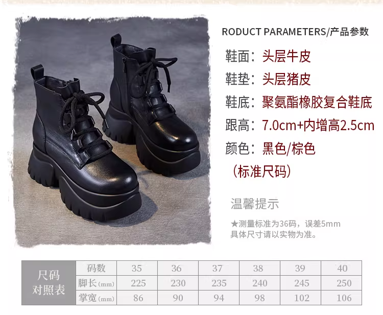
7cm跟高+2.5cm内增高,实际增高9.5cm,但5.5cm防水台让坡度只有4cm,走路如履平地。
头层牛皮鞋面柔软不易磨脚,头层猪皮鞋垫吸汗透气,适合长时间穿着。
24cm筒围+10cm筒高,刚好包裹脚踝最细处,拉长小腿线条。
我常用它搭配高腰牛仔裤(裤脚微微盖住鞋面),或搭配A字短裙优化比例。无论是上课通勤,还是周末出游,都能悄悄提升气场。
四、珊珊同学的选鞋建议
1.按脚型选码:标准脚型选正码,大脚趾外翻建议选大一码。2.按衣柜配色:黑色经典百搭,棕色温柔复古,可根据衣橱主色调选择。
3.先试后搭:收到鞋子后,先搭配衣橱里最高腰的裤子/裙子,感受“立竿见影”的效果。
欧易金旗舰店推荐
今日好物:内增高真皮女鞋
 点此直达:https://detail.tmall.com/item.htm?id=847903606864
扫码可直达店铺

珊珊寄语:穿搭是外在的修饰,自信是内在的光。愿你每一步,都走得踏实又漂亮。